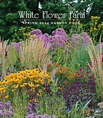
Color Themes
Every gardener feels drawn to certain colors. One way to play with design schemes is to focus on a single favorite color. Generally, the pastel "tints," as well as the darker "tones," of that color will all work well when grouped together. This is especially true for yellows, purples, and blues. Of course, you pretty much can't go wrong with green, Nature's most ubiquitous hue. It looks good with every other color, either as a kindred spirit, or as a contrasting foil.
Another simple approach is to choose a color and then bring in a close relative on the spectrum, such as pairing yellow with orange or combining purples with blues. These are called color harmonies, and they tend to look reliably pleasing.
Here's one caveat to consider: not all colors within the red family always get along. If red is a favorite color, try to sort out "cool" reds -- which have some blue or violet mixed in -- from "warm" reds that have orange or brown in their makeup. Some say it's best to separate the shades, but it's not a hard-and-fast principle. Just be aware that designing with reds can be a bit trickier than playing with easy-going yellows. Then rely on your designer's eye to decide if certain colors are pleasing together.
When you want some contrast, the easiest way is to just look for a color's opposite, or complement. For yellow, that's purple. For orange, that's blue. And for red, it's the Christmas complement of green. To find more subtle opposites, pick up a color wheel that will reveal a complete spectrum of opposites and relatives.
The main thing is to have fun playing with color. The hues of a garden's palette constantly change from season to season, so enjoy the shifts and tweak your designs as the plantings evolve. For more design ideas and information, take a tour with nursery manager Barb Pierson in our "Garden Inspirations" video, or browse articles in the Garden Help section of our Web site.


